When you pick up a picture book, you look at the pictures first. That's not a criticism. The art does a lot of work before you read a single word. It sets the mood, tells you who to care about, and even suggests how fast to turn the page. For parents and teachers who want to make their own storybook, choosing an illustration style is one of the most important decisions you'll make. It changes how the story feels, how easy the words are to follow, and how many times your child will ask to read it again tonight.
Classic Hand-Drawn Styles: Watercolor, Pen and Ink, and Gouache
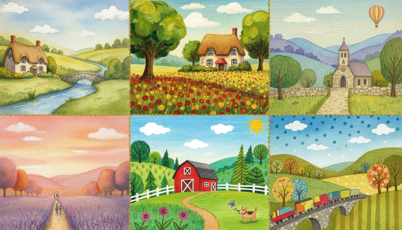
Think of the bedtime books you grew up with. Soft smudges of watercolor, fine ink outlines, the slightly rough texture of real paper. These hand-drawn styles give the page a warm, tactile quality that feels familiar. Watercolor is especially well suited to gentle stories about friendship, nature, or quiet adventures. The paint can bleed softly, suggesting fog or a dreamy summer evening without spelling everything out. Pen and ink adds structure, with crisp lines that make faces expressive, while gouache offers a matte, opaque finish that feels both understated and complete.
These materials allow for subtle shading, which helps a quiet story carry more emotion. A character's cheeks might get a faint rose wash when they feel shy. A tree might have bare branches drawn simply, but the ink pressure hints at worry. For a parent creating a storybook from scratch, this style is lovely, though it does take practice to control the water or the line weight. If you have a soft, slow story in mind, this is likely your friend.
Bold Graphic and Flat Design
At the other end of the shelf sits flat design. Simple shapes, a limited color palette, and high contrast make every element easy to spot. This is the style you see in many board books for toddlers, and for good reason. Little eyes don't need a lot of clutter. They need clear shapes and obvious actions. When a blue elephant raises its trunk, your child knows exactly what's happening.
Eric Carle built a whole career on this idea. His painted paper collages are bold and repetitive, but they never feel boring. The repeated forms and bright colors actually help young readers anticipate what comes next. If your story has rhythmic text or a repeating phrase, flat graphic design can match that beat page by page. It keeps the focus on expression and gesture, which is almost always what carries a simple narrative.
Soft Digital Painting
Digital painting is where a lot of modern storybook illustration lives. Software brushes are designed to mimic traditional media, so you can get soft watercolor washes or scratchy charcoal lines without needing a whole studio. The advantage is control. You can undo a stroke, adjust a color, or change the lighting on a page in seconds. For dreamy or magical tales, digital painting allows delicate gradients and glowing light effects that would be very hard to achieve with physical paint.
Digital tools are also where "ai illustrations" comes into the picture. An ai illustrations generator can help you try out different looks quickly, which is great if you're still deciding on a direction for your book. You can generate a few versions of a character with different moods or palettes, then pick the one that feels right. The important thing is that the style stays consistent, especially for a personalized storybook where the same child appears on every page. That's where ai illustrations for children's books shine, because the tool can keep the character's face, clothes, and colors uniform even as the scene changes.
Mixed Media and Collage
Mixed media is the tactile cousin of flat design. Paper scraps, fabric swatches, buttons, photographed leaves, or even bits of string are layered together to build each scene. The result is depth you can almost feel with your eyes. Kids often pause on these pages to inspect every corner and find the little details. What is that? Is that real denim? Why is that strip of paper torn?
This style encourages close looking. For an imaginative or multicultural story, collage adds a sense of handmade discovery that fits perfectly. Celebrating craft is easy when the book itself feels crafted. It also pushes readers to look for texture rather than just color, which can be a wonderful change for children who usually rush through pages.
If you're concerned about the learning curve, keep in mind that collage doesn't require a steady hand, just a good eye. Even a simple construction paper sun can look warm and intentional when surrounded by textured layers.
Matching Style to Age and Theme
The style you choose also needs to match the age of your reader. Toddlers between two and four respond best to high-contrast graphics with simple shapes. Too much detail on a page can actually distract them from the story. The flat design or collage style works well here. For four- to six-year-olds, you can introduce more substance in a gentle watercolor wash or a slightly more detailed digital scene. They still need clear narrative cues, but they're ready to follow a character across a faint background setting.
Once you get to six to eight, readers can handle mixed-media textures and more sophisticated digital painting. At this stage, they notice mood lighting, symbolism, and the subtle emotions on a character's face. A complex plot with a twist will benefit from art that supports those layers rather than flattening them.
Think about your own story's theme too. A quiet adventure about a lost rabbit needs softer washes. A bold counting book wants graphic forms. A fable about imagination could celebrate mixed media's playful chaos. The key is to choose one style and stick with it. A consistent look builds trust and helps children focus on the narrative instead of the medium.
A Few Practical Notes on Process
If you're just starting out, study the work of others. Martin Salisbury's book, Illustrating Children's Books, is a priceless field guide. Look at picture books from your library and notice how the art makes you feel before you read the words. And yes, you can find illustrations for children's books free online for inspiration, but always ask whether a particular style serves the story or just decorates it.
For parents and teachers who want to try their hand without becoming professional artists, an ai story book tool can do a surprising amount of heavy lifting. Some ai book recommendations platforms even let you search for styles and themes as a starting point. The magic happens when you pair the technology with your own taste. You can say, "I want this character to feel brave but a little nervous," and let the ai illustrations suggest a palette or composition.
Your Turn
Picking an illustration style isn't about finding the "best" one. It's about finding the one that makes your story easier to love. Whether you go with the warmth of watercolor, the clarity of flat design, the flexibility of digital painting, or the texture of collage, trust your instincts. Hold a page up next to your child and watch their face. That reaction will tell you everything.
If you want to make something like this yourself, Fablekit is a storybook studio where you can write, illustrate, and publish a personalized children's book. Your character stays consistent on every page, and the style stays exactly the way you imagined it. It's a low-pressure way to turn your bedtime favorite into a real book your child can hold and treasure.