You have a manuscript. It's a good story, maybe 600 words, the kind your kid asks for every night. But it's just words on a page. To become a real picture book, it needs pictures. And you can't draw a straight line.
Here's the good news. You don't need to draw professionally. You need a workflow that turns your manuscript into a finished book using repeatable characters and simple layout tools. This is the same approach many self-published authors use. It's practical, and it works.
Start with a Clear Page Plan
Before you touch any art tool, plan your pages. A typical picture book has 32 pages, but that includes front matter and title pages. For your story, you'll probably have 12 to 15 spreads. A spread is two pages side by side.
Take your manuscript and list each spread. For each one, write what happens and what the illustration should show. Do you need a full-page image or a smaller spot illustration? Where will the text sit? At the bottom, or in a corner?
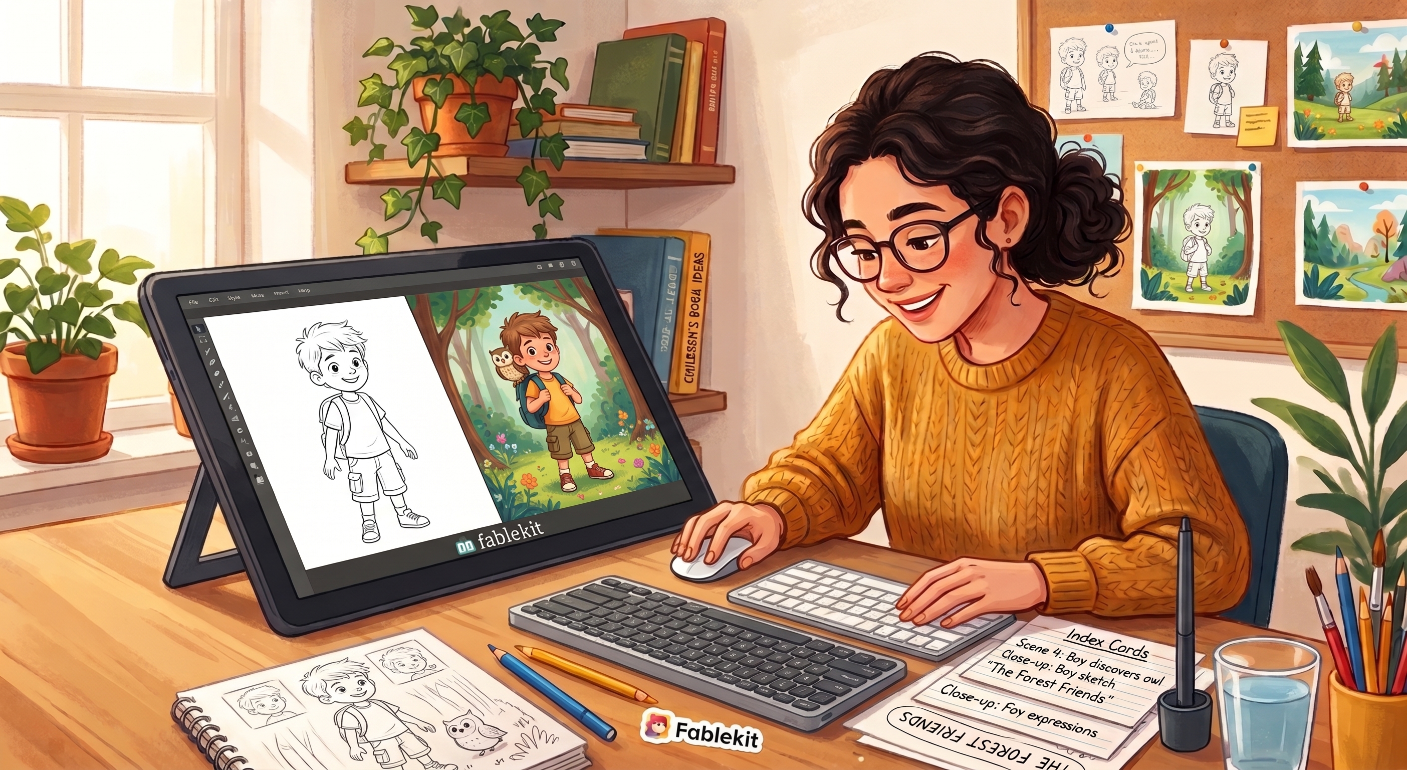
A simple way to do this is with index cards. Put one card per spread. On the front, write the action. On the back, sketch a rough box for the image and a rough box for the text. You don't need art skill. Just a rectangle with a squiggle inside. The point is to see the order before you start creating.
You can also use a table in a document. Spread number, text snippet, image description. Whatever feels natural. The goal is to know exactly how many images you need and what each one shows.
Build a Repeatable Character Library
This is the secret to making a book without an illustrator. Your main character must look the same on every page. If her hair changes from curly to straight between pages, kids will notice.
So choose a few defining traits. Maybe she wears a red sweater and round glasses. Or he has a blue cap and a missing front tooth. Pick two or three details and keep them exactly the same on every page.
Create two or three pose variations. Your character needs to stand for some scenes and sit for others. You might also want a pose where she's reaching for something. The key is that each pose keeps the same clothing and the same face.
If you're using Fablekit, this is where the character builder comes in. You design your character once, then save each pose as a reusable asset. You can drag that asset onto any page in your book. No drawing required. Just pick the pose that fits the scene.
Even if you use other tools, the principle is the same. Build a small library of character images that you can reuse. Don't redraw from scratch each time. Reuse and adjust.
Use Guided Templates to Place Images and Text
Now you're ready to assemble pages. A guided layout template does the heavy lifting. It knows your book's trim size, say 8 by 8 inches, and it shows safe zones for text. Safe zones keep your words away from the edges where pages get trimmed.
Pick a layout grid that matches your book. Place your character asset into the illustration box. Adjust the size so the character fits comfortably, with a little breathing room. You don't want her head touching the top of the box.
Then add your manuscript text into the text boxes. Keep the font size large. Picture books are read aloud, often from a lap. A font size of 16 to 18 points is a good starting point. You want the words to be readable from a few feet away.
At this stage, you're not making art. You're arranging pieces. It's more like scrapbooking than illustration. And that's okay.
Review and Refine for Readability
Once every page has its character and text, step back and check for readability. This is the step people skip, and it shows.
First, check contrast. Light yellow text on a white background is impossible to read. Dark text on a light background is safest. If an illustration is busy behind the text box, consider adding a subtle white panel behind the words.
Second, check that no important part of the character is hidden. Does her face sit behind the text box? Is her foot cut off by the page edge? You can adjust the character position or scale to fix that.
Third, read the book aloud to a child or a friend. This is the real test. Listen for pacing. Does the page turn come at a natural moment? Is there too much text on one page? Note any spots that feel off, then go back and adjust.
You might do two or three rounds of this. That's normal. Even professional authors revise.
Export and Prepare for Print or Sharing
When you're happy with the pages, it's time to export. For printing, you want a high-resolution PDF with bleed marks. Bleed is the extra space outside the trim edge. It prevents white lines from appearing at the edges of your pages. Most printing services require 0.125 inches of bleed.
Order a proof copy. Yes, it costs a few dollars. Do it anyway. The screen can't tell you how colors look on paper or how the page feels in a child's hands. A proof copy will show you spacing problems you never noticed on screen.
If you're just sharing digitally, export a standard PDF and send it to family. You can also upload it to a printing service and have copies made for gifts.
A Tool That Fits This Workflow
You can do this with a lot of different software, but most of it was built for people who already know design. Fablekit was built for authors who are keen to illustrate aided by a process and tools. It keeps your character consistent across every page, handles the layout for you, and lets you export a print-ready PDF. If you want to author a children's book without hiring an artist or illustrator, it's a good place to start.
The best part is that children don't care if the art is perfect. They care that the character they love shows up on every page. That's the whole job. And you can do it.